Photo Editing Tutorial - Lightroom and Photoshop Basics
Have you ever wondered how we edit our photos? Now you can see for yourself, and learn the basic steps we do from start to finish.

SOOC

Post-Lightroom

Post-Photoshop
ITEM CHECKLIST
Photo taken with a DSLR (preferably RAW format)
If you currently don't shoot in RAW, we highly recommend you make the switch! It makes the editing process much smoother since it records all of the data from the camera sensor.
You're welcome to try with a phone photo, but your results will turn out as well.
Adobe Photoshop CC*
Adobe Lightroom CC*
*Other versions should work just as well. Our screenshots will be taken from the CC versions, so your programs may look slightly different.
Step 1: LightROOM
You can do incredible things with Lightroom, but for now, we'll cover the basics. These are options we always use when editing. Start off by importing your photo and going to the Develop tab at the top.

BASIC
We always adjust Exposure first. Notice how our original photo is quite dark? It's always better to underexpose rather than overexpose. Dark photos can be brightened, but not all bright photos can be darkened.
Since this photo was taken during a sunny day, we brought Highlights all the way down and Shadows all the way up, to even out the lighting. Depending on your lighting, your settings for these could be drastically different (or you may not need them at all!).
We like to bring Whites up, as we prefer a brighter white. Depending on your editing style, you may want to bring them down to give it a grayer look.
In most cases, we like to bring Blacks down to emphasize the stripes on Leo and Ori. In this photo, the stripes were already pretty dark, so we brought Blacks up just a tiny bit.
Clarity is a great setting to bring out textures and details in your photo. We usually like to bring this up to around +15, which helps better highlight the individual strands of fur.
We then like to play around with the Temperature. The higher the setting, the warmer your photo will look, and the lower the setting, the cooler your photo will look.
Tint will also help adjust the overall colors of your photo. Bringing this up will add a more purple hue, and bringing this down will add a greener hue.

Original

After basic settings are applied
HUE, SATURATION, LUMINANCE
Hue is the shade of a color. This can be a great tool for adjusting the color of foliage, sky, and water. For this particular photo, I wanted the Magenta hues to look more red rather than pink.
Saturation is the intensity of a color. The higher the setting, the more vivid the color, and the lower the setting, the duller the color. You can see we made quite a few adjustments here. In order to make the rainbow really pop, we brought up the Red, Green, Aqua, Blue, and Purple. Notice that Orange and Yellow were barely touched. This is because Ori's fur color consists mainly of those two colors. Always keep this in mind when adjusting colors, in order to keep your pet's fur color looking natural.
Luminance is the brightness of a color. Since our editing style is on the brighter side, we hardly ever decrease the luminance of colors. Again, we made adjustments with the goal to bring out the colors in the rainbow. However, this time around, both Orange and Yellow were touched to brighten up Ori's fur a little.


DETAIL
We prefer to keep Sharpening at 0, and manually sharpen certain areas in Photoshop.
Since we sometimes shoot at a higher ISO setting (800+), we like to adjust the Noise Reduction settings to smooth out any graininess in the photo. We find that putting Luminance to the 10-15 range does the trick in most cases. As for Color, we leave it at the default of 25.

Before HSL and Detail settings are applied

After HSL and Detail settings are applied

ADJUSTMENT BRUSH
Lightroom has an awesome tool called the Adjustment Brush, which allows you to paint over your photo and make adjustments to only those specific areas. We won't go in depth about it here, as we didn't use it for this particular photo. However, this is extremely useful for fixing underexposed and overexposed areas in your photo to create the appearance of more even lighting. If you are shooting in RAW, we recommend making as many adjustments in Lightroom as possible before switching to Photoshop. As soon as you switch to Photoshop, changes you make will be to a .TIFF file, rather than your original RAW file.
Keep in mind that the brush does not let you adjust HSL for the area. Instead, there is one setting for Saturation which will affect all colors for the entire area selected. If you want to make adjustments to specific colors in certain areas, you will have to rely on Photoshop.
For a good tutorial on how to use this tool, click here.
Step 2: photoshop
To open up your photo in Photoshop via Lightroom: right click your photo and select Edit in > Edit in Adobe Photoshop. Select Edit a Copy with Lightroom Adjustments.
You will be presented with a bunch of tools, likely to the left side of the screen. We will go over the 4 most important tool sections that we use (shown outlined in red). We say sections, since you can click and hold on these icons to display a larger list of tools. From top to bottom:
Spot Healing Brush Tool
This can be used to retouch areas with one click of your mouse. For example, if you have a small blemish somewhere, you can paint over it with this tool and it will automatically try to fix it and fill it in based on the surrounding area. Photoshop does a pretty good job of determining a good match, but this tool does not work well 100% of the time.
Clone Stamp Tool
This is another tool to retouch areas. We use this tool more often, as we can determine specific parts of the image to clone before painting it onto another area.
Blur/Sharpen Tool
The blur tool will allow you to soften up areas of your image by making it more (you guessed it) blurry. The sharpen tool will emphasize the texture in the area you select, which helps draw focus to it.
Dodge/Burn Tool
The dodge tool will lighten up areas of your photo, and the burn tool will darken up areas of your photo.
Tip: Use the ‘[‘ and ‘]’ (bracket) keys to easily adjust the size of your brush.


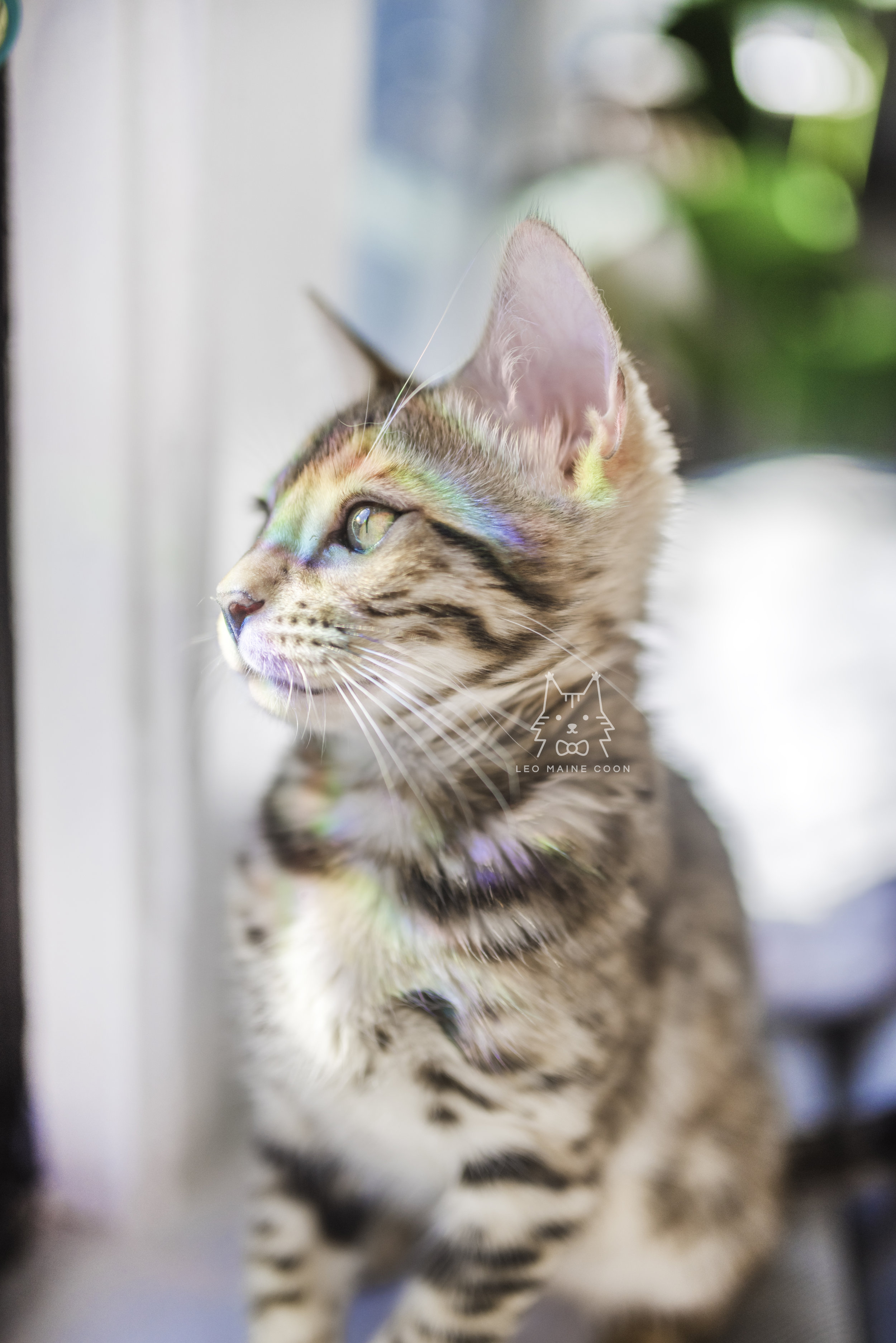
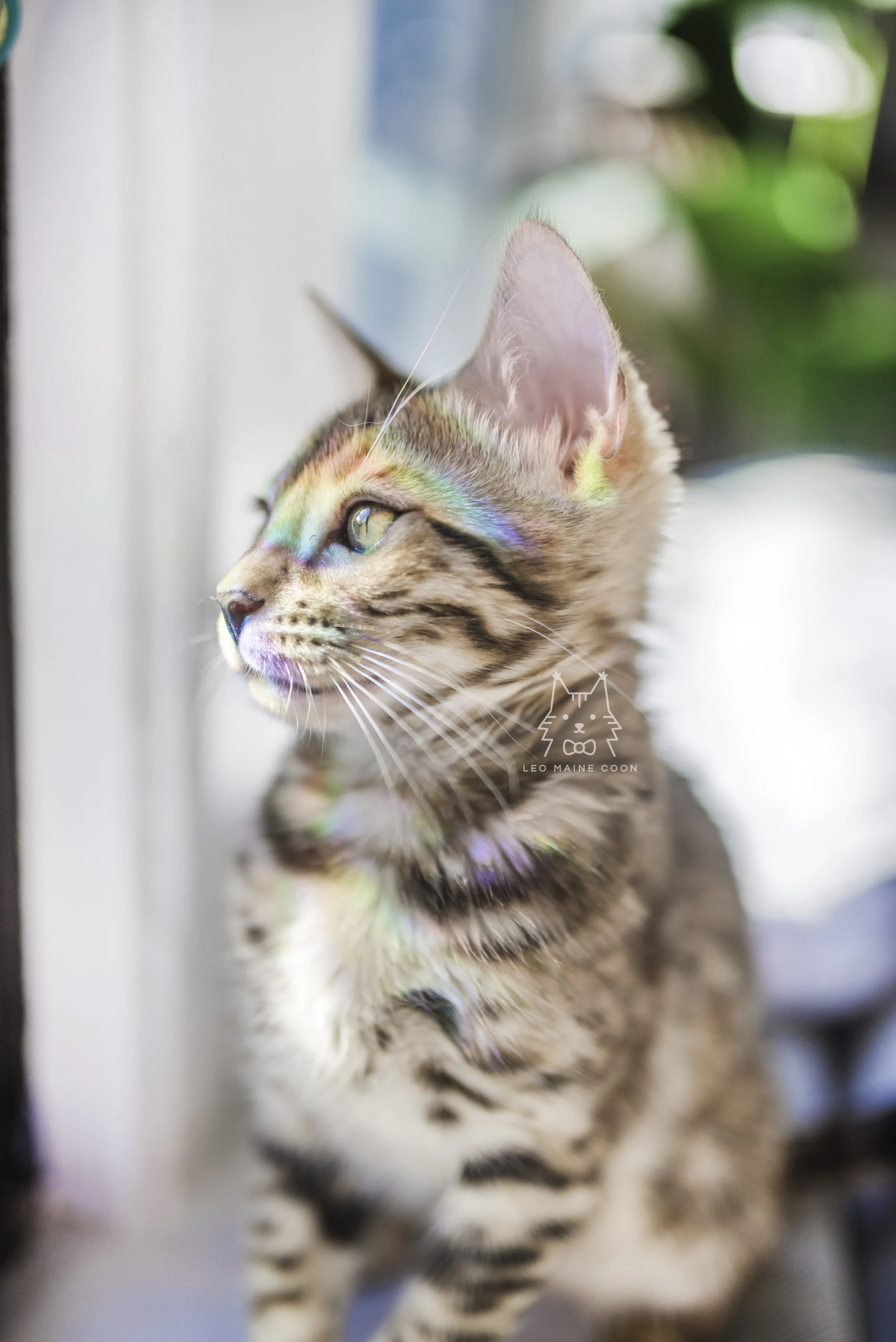
DODGE TOOL
Our very first step is usually to use the dodge tool and brighten up areas of the image that we weren’t able to or didn’t do in Lightroom. We keep this at the default values of Range: Midtones and Exposure: 50% (visible at the top of your window). There is no specific method to where we choose to light up. Just use your own judgement and create what you think looks best! Don’t be afraid to go over certain areas more than once.
Remember, you can always undo your changes. Photoshop will only let you do Ctrl+Z to undo once, but you can go back pretty far via the History window. If this isn’t visible on your screen, you can open it up by going to Window > History at the top.

Before Dodge

After Dodge
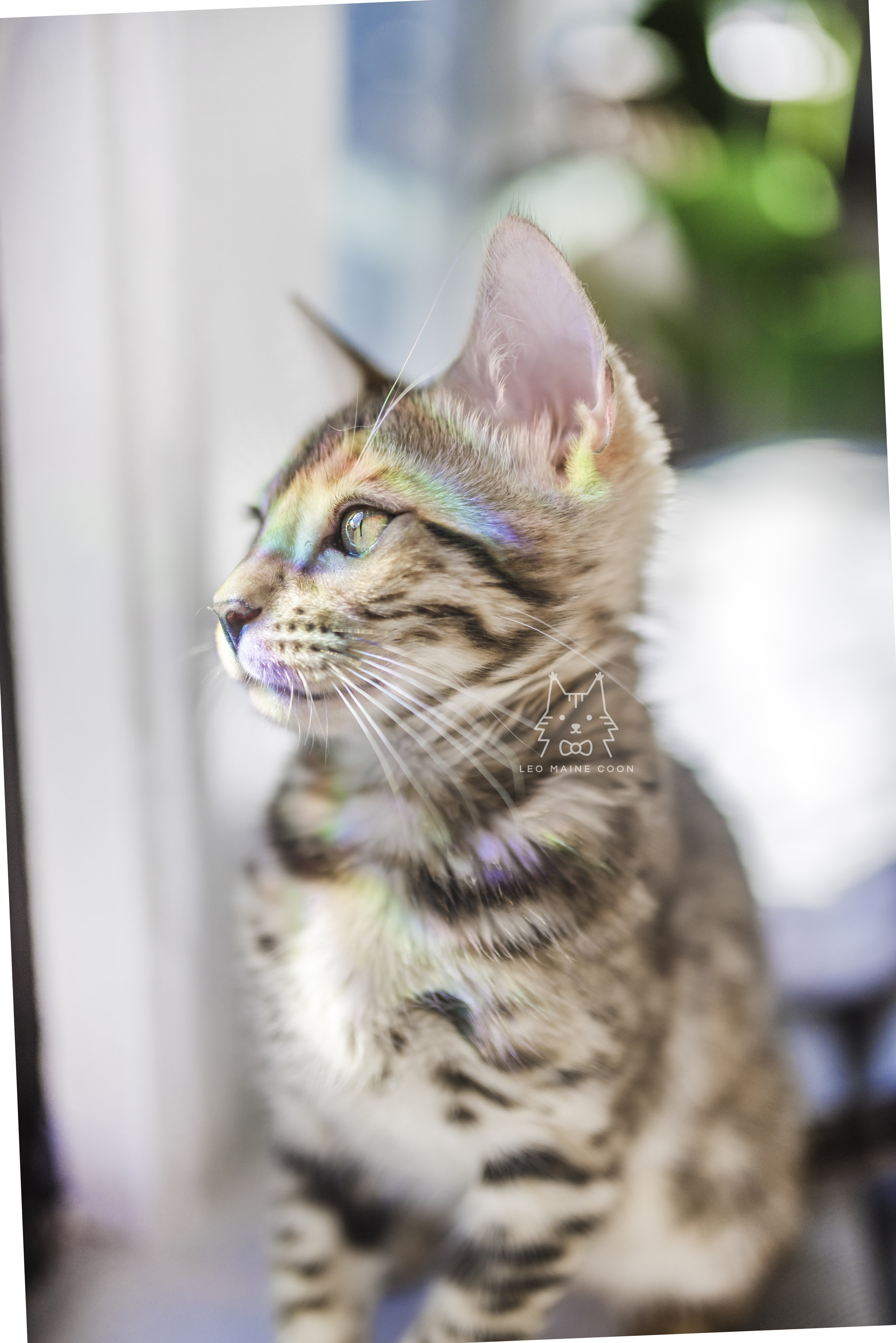
BURN TOOL
If you find certain areas are too bright, you can darken them up using the burn tool. We usually do not use this tool much. In this particular photo, you can see that the area around the muzzle is a bit brighter than the areas around it. To make it more evenly lighted, we use the burn tool only in this area.
Before Burn
After Burn
SHARPEN TOOL
We always use the sharpen tool to bring out the details in the eyes. Although the difference is subtle, it definitely helps bring the viewer’s focus more to the eyes once the sharpen tool has been used.

Before Sharpen

After Sharpen
SPOT HEALING BRUSH + CLONE STAMP TOOL
Before we utilize these tools, we wanted to straighten the image so that the blue area in the background would be straight. To rotate your image in Photoshop:
In the Layers panel (likely bottom right), double click on your Background layer to open up a pop-up, and click OK.
Transform using Ctrl+T
Using your mouse, click and hold to rotate the image until you’re satisfied. We like to bring out the grid lines with Ctrl+’ (apostrophe) to be extra accurate. Use Ctrl+’ to hide the grid lines once you’re finished.
We now have some empty space after rotating. In order to fill those areas, we use a combination of spot healing and cloning. For this image, Photoshop was clever enough to allow us to use the spot healing brush to fill in all the empty areas. You’ll also notice we covered up the darker area on the left edge of the original photo.
To use the clone stamp tool, you first have to hold down Alt to select a specific area of your image to clone from. Once you do that, you can use your left mouse button normally to paint over specific areas. We recommend you practice with this tool, as it can take some getting use to.

Before Rotate
After Rotate, Before Spot Healing Brush + Clone Stamp

After Spot Healing Brush + Clone Stamp
FINISHING TOUCHES
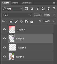
Since we were going for the rainbow theme in this photo, we wanted to add some extra colors into the background. We created 2 layers (Ctrl+Shift+N to create a new layer) for color adjustments. Be sure to place these above your original layer.
Our first layer (Layer 1) is set to Color. Now when you paint on this layer with any color, it will show through onto your image. We wanted to add some red/pink to the top of our photo.
Our second layer (Layer 2) is set to Hue. Any colors you paint on this layer will not affect the image’s original saturation or luminosity values for the area—it will only change the hue. We wanted to make the bottom left less reddish, so we painted over it with a gray color. To create the rainbow at the top right, we painted over the photo with a variety of colors to mimic a rainbow.
As with all things, play around with these types of layers until you get a better feel of what each one does.
Lastly, we created a new layer (Layer 4) for our watermark.


Before finishing touches

After finishing touches
TA-DA!
Editing complete! Save your changes with Ctrl+S and close out of Photoshop. We like to export our images via Lightroom to end up as little quality loss as possible after uploading to Instagram. Go to File > Export at the top, and adjust your Export Location Settings. Scroll down and change your File Settings, Image Sizing, and Output Sharpening to below:

To make things easier the next time you export, you should save your export settings as a User Preset. On the left hand side of the export window, click Add, then name your preset. Right click your newly created preset and select Update with Current Settings. Now you’re all set! Next time you need to export a photo, just go to File > Export with Preset and select the one you made. You can also create another preset to export your images at full resolution if wanted.
QUESTIONS?
If you have any questions or need clarification, just leave a comment and we’ll respond ASAP!